InCo: Bingo
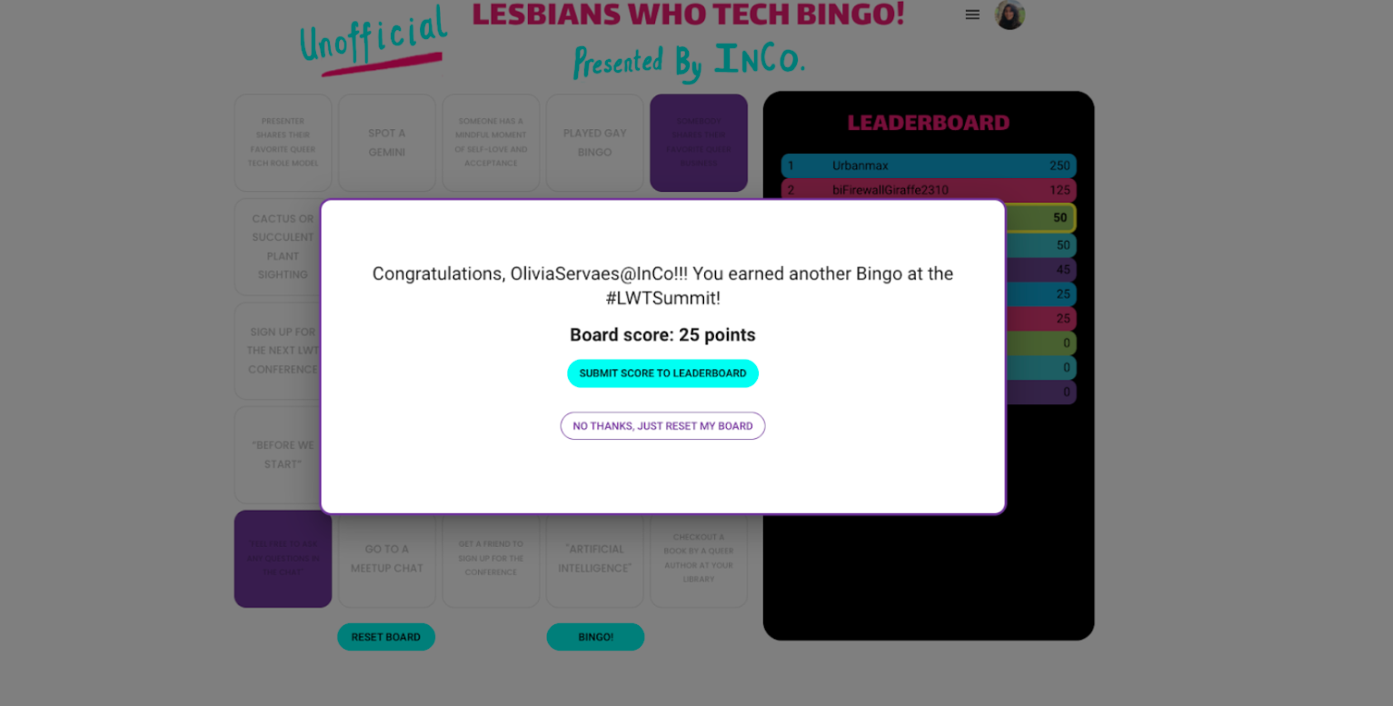
At Interconnected Collective (InCo), we aimed to enhance networking at the Lesbians Who Tech & Allies virtual pride conference by gamifying it with a fun, immersive twist on classic bingo. Our goal was to foster new connections among like-minded individuals, centered on the question: "How might we improve the virtual networking experience?” By reimagining a beloved game, we created a fresh, engaging way for attendees to connect and interact.
Role
Lead UI Designer
UX Designer
Product Designer
Tools
Discord
Figma
Google Drive
UX/UI Team
Liz Baranowicz
Julie Nguyen
Lynds Lesh
Enhancing the networking experience at the Lesbians Who Tech and Allies Conference with Bingo
Virtual conferences have been flourishing, but the networking aspect can often feel a bit awkward. InCo aimed to transform this experience by giving conference-goers something to bond over, creating a more engaging and connected virtual environment.
Site architecture
Planning the site architecture
Before, there was only one page dedicated to the bingo game. I had to plan out the site architecture to create a more organized and user-friendly experience.
Sitemap
Developing the Bingo Page
Inspiration
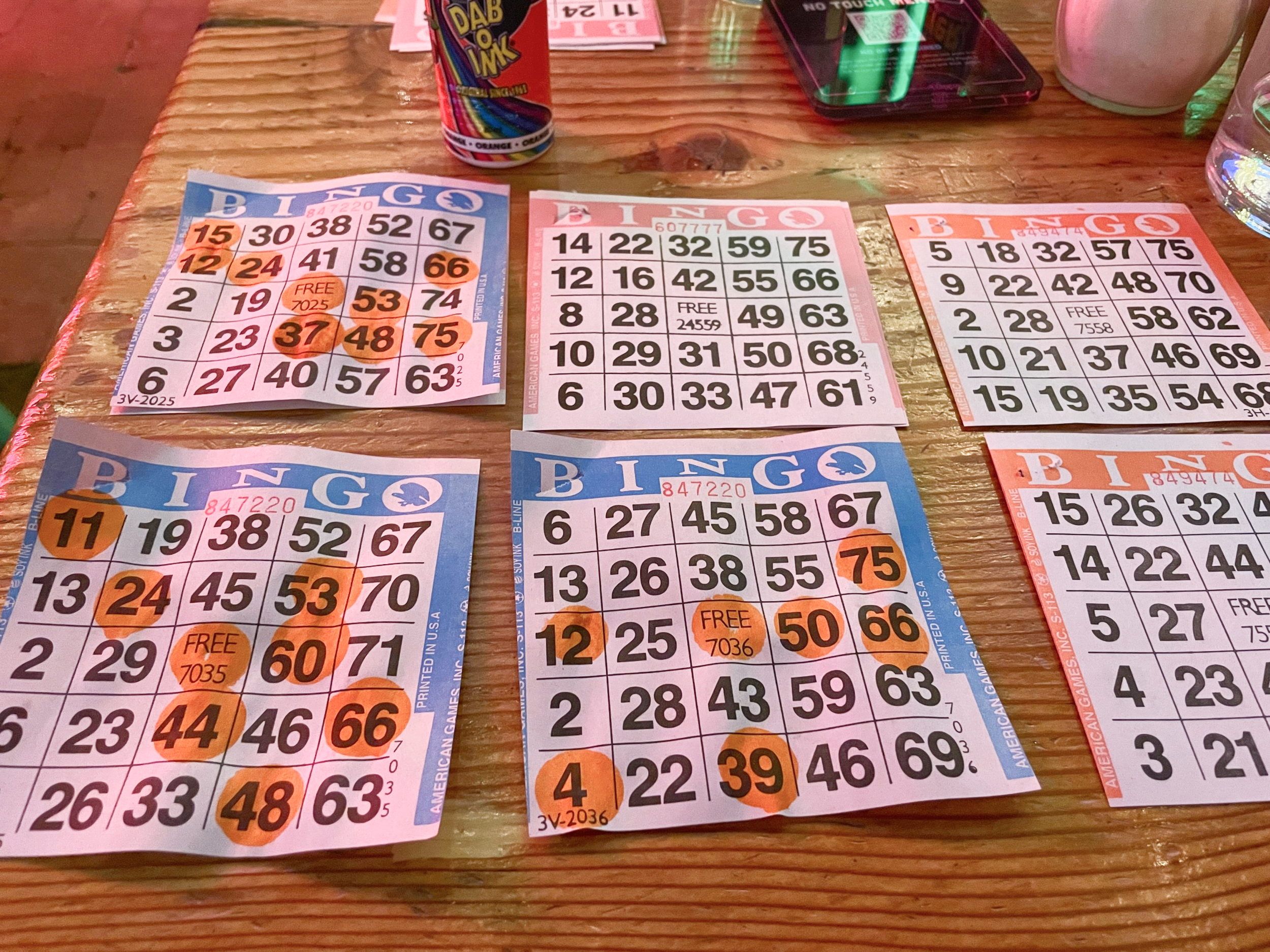
Our team of 3 designers first gathered inspiration by collecting images from real-life boards and online games.
Low-Fidelity Wireframes
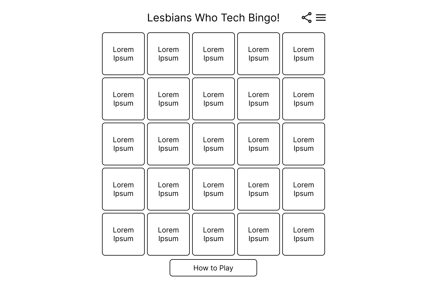
Low-fi wireframe 1
Wireframe 1 featured a hamburger menu for site navigation.
Low-fi wireframe 2
Wireframe 2 had a navigation header to explore the website with the hamburger menu only providing information on how to play the game and light and dark mode switch.
For the mid-fidelity wireframes, we applied the established color guide and UI guidelines to the low-fidelity designs.
Mid-fidelity wireframes
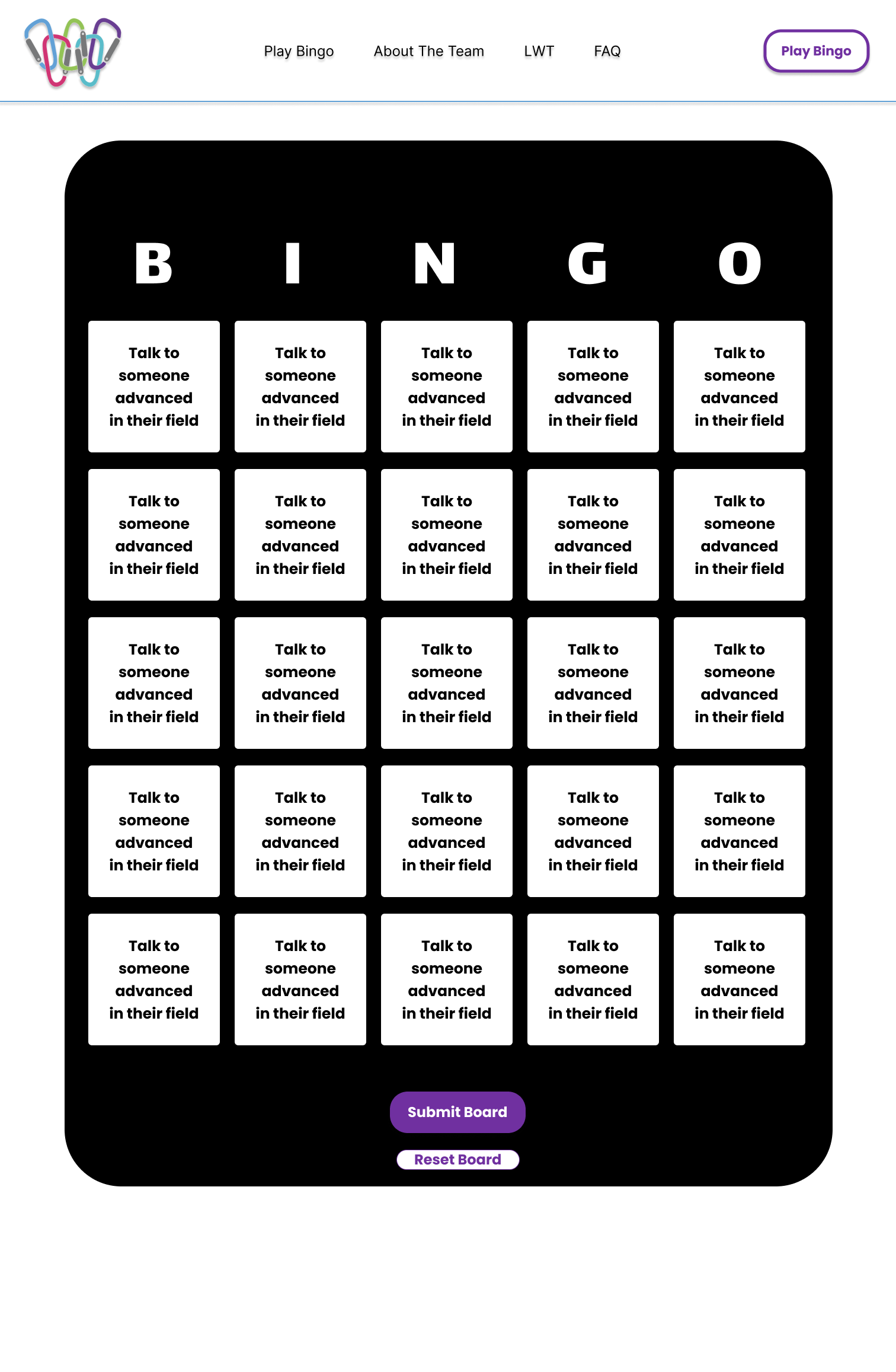
Mid-fi wireframe 1
Mid-fidelity wireframe 1 drew inspiration from online games and casinos, featuring bright colors and numerous patterns. However, the gradient on each tile, combined with white lettering, proved to be inaccessible and hard to read.
Mid-fi wireframe 2
Mid-fidelity wireframe 2 was a complete reversal from the first, featuring minimal colors and no patterns, resulting in a design that was too plain.
High-fidelity wireframes
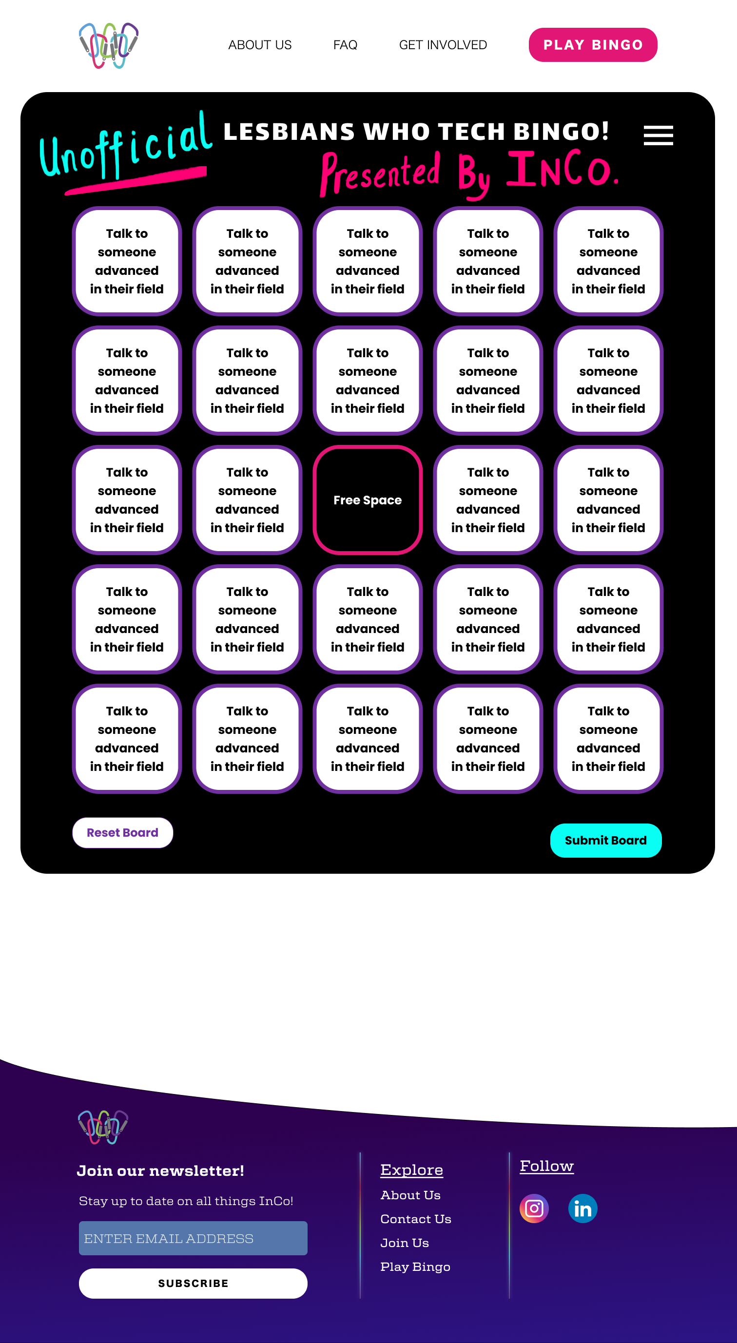
Mid-fidelity wireframe 2 served as the foundation for our high-fidelity wireframes. Our visual designer enhanced the bingo board by adding illustrations, creating visual intrigue and ensuring the game aligned with our established branding.
High-fi wireframe 1
Wait!
How can our design improve networking?
By adding a leaderboard!
Including a leaderboard allows users to display names. This offers more opportunity for connection and healthy competition to encourage repeat play. With a leader board users can find one another outside of the game.
Adding a leaderboard
Inspiration
Examples of leaderboards were collected for inspiration.
Low-fidelity wireframes to decide how the leaderboard should fit on the screen
Side leaderboard wireframe
Bottom leaderboard wireframe
Decision to proceed with the side view leaderboard
We decided to proceed with the side view of the leaderboard for several key reasons:
Visibility: This layout allowed users to see the leaderboard while playing bingo without needing to scroll, ensuring they could keep track of their progress and rankings effortlessly.
Real-Time Updates: By having the leaderboard visible in real time, it created a competitive drive among players, motivating them to stay engaged and strive for higher scores.
Networking Opportunities: This design also let users see who else was playing, providing additional opportunities to network and connect with other attendees during the game.
High-fidelity wireframes
High-fi wireframe with side leaderboard 1
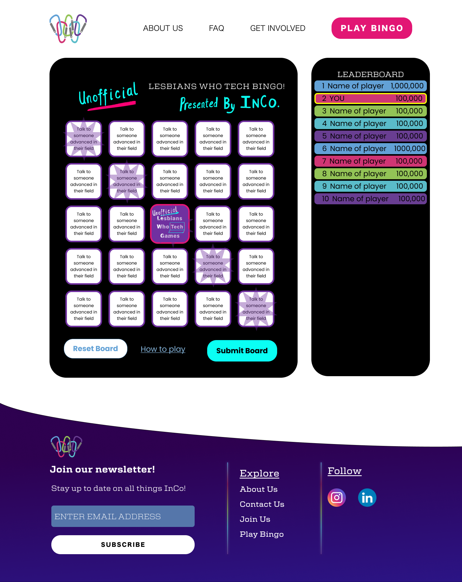
Utilizing a blue option with a blue, white, and pink color scheme proved too light for accessibility standards.
High-fi wireframe with side leaderboard 2
A colorful leaderboard, reflecting the established color scheme, improved accessibility. Using a black background to mimic the bingo board created a cohesive appearance.
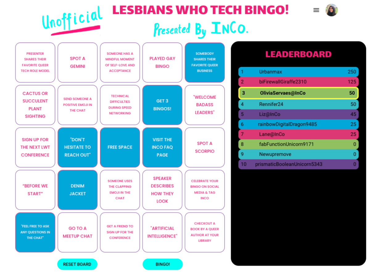
Final Bingo Screen
Key Design Takeaways:
-Leaderboard: Added to foster a sense of community and competition, making the game more enjoyable for conference attendees.
-Improved Accessibility: Game tiles now feature a white background with bold black text, replacing the previous neon pink on white, to enhance readability and accessibility.
-Enhanced Tile Selection: Introduced new, clearer ways to indicate when a tile has been chosen, improving the overall user experience.
Bingo Live
See how Bingo actually connects people across the country…
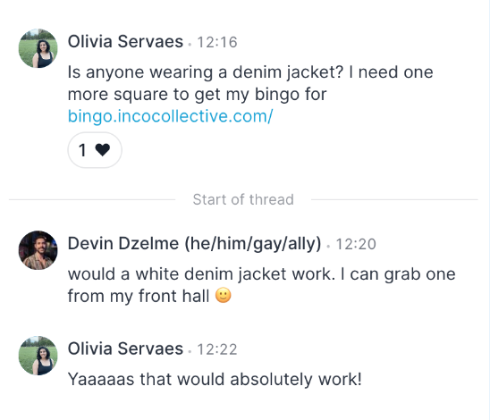
I was one square away from getting a Bingo on my board. I was looking for, “Spot someone wearing a denim jacket” but hadn’t run into anyone in Speed Networking wearing one yet!
I decided to take matters into my own hands and ask the chat…
Success! I connected with Devin and he sent me this photo:
Now, I was able to click the final tile I needed to get a Bingo!
Not only did I get a Bingo but Devin and I remain connected and support one another in our tech careers.
Reflections
Challenges and future iterations
We faced challenges due to limited resources, relying only on our skills and minimal tools. This prevented us from making the game fully mobile-friendly and accessible. However, we ensured each bingo card could be read with a screen reader for the launch. Despite these limits, our creativity made for an engaging experience at the Lesbians Who Tech & Allies virtual pride conference. We plan to improve the game's responsiveness and accessibility in the future.
Pride points
One of the key pride points of our project was our ability to successfully work as a team entirely remotely. We coordinated across different time zones to ensure excellent collaboration and steady project progress. Additionally, we created a leaderboard that significantly improved the networking experience by fostering a sense of community and friendly competition among conference attendees. This innovative feature helped attendees connect more meaningfully and added an engaging layer to the virtual event.


