Spotify Audio Exercises
How can Spotify become the perfect companion for fitness enthusiasts? By integrating audio-guided workout routines that allow users to follow trainers while listening to their favorite music!
Tools
Figma
Google Drive
Zoom
Role
UI Designer
UX Designer
Researcher
Time Frame
80 hours/10 days
Do you remember jazzercize?
It was fun because of the music. Knowing that music can boost endurance by 15%, how can we integrate this fun factor into Spotify for fitness enthusiasts?
This case study explores just that.
Research
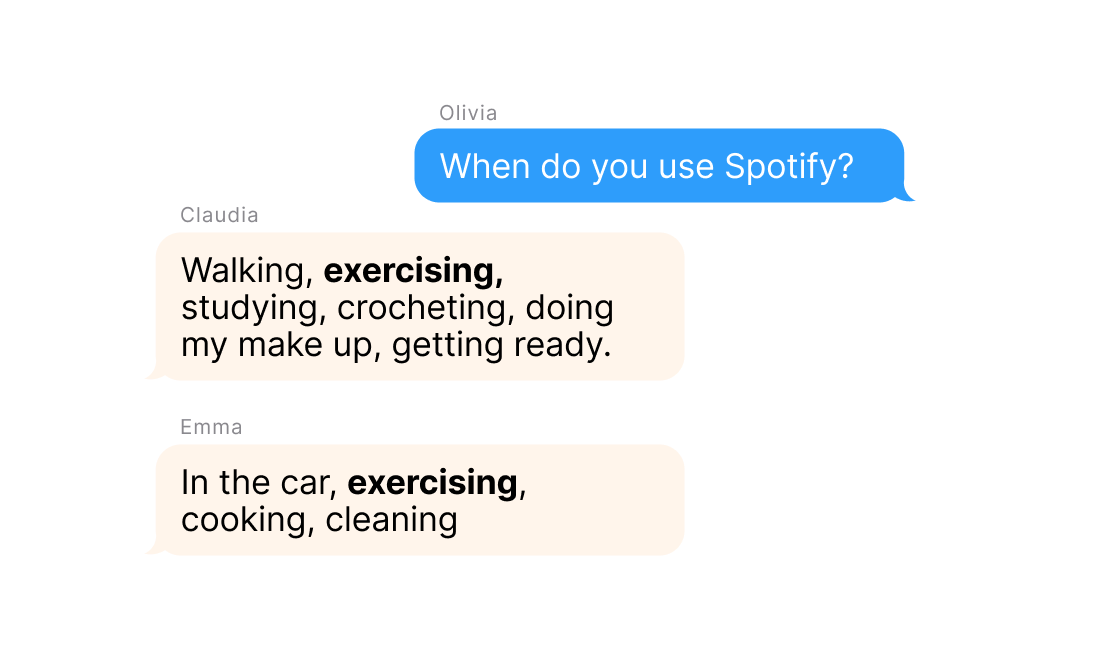
100% of Spotify users report that they use the app while exercising
The responses from interviewees aged 20-31 were organized using an affinity map. This analysis revealed key findings:
50% use the app while doing something that requires focus
75% of those interviewed had complaints about the Spotify homepage
Who might benefit from a fitness integration on Spotify?
The new guided workout feature on Spotify caters to users like Marta by streamlining their fitness journey:
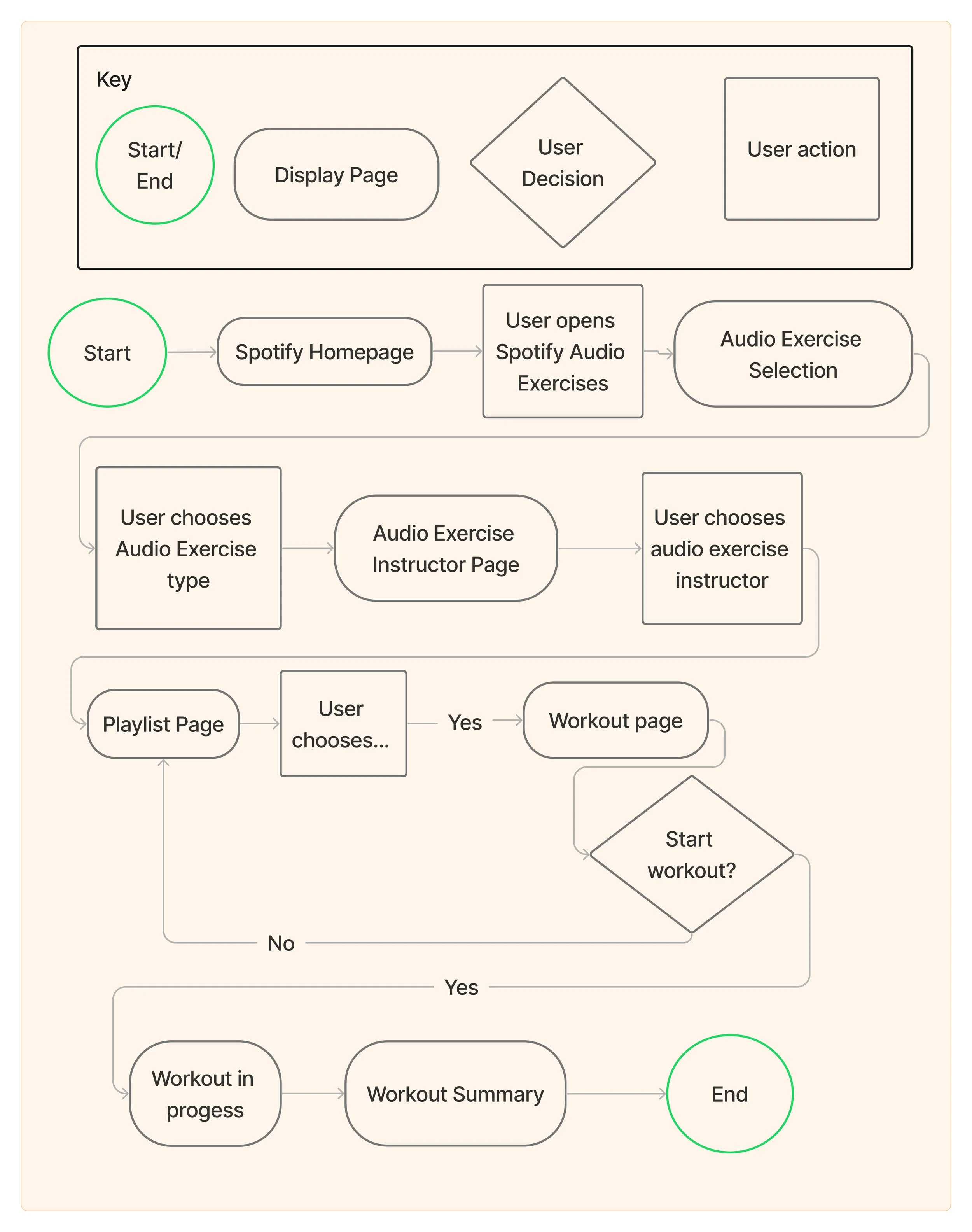
Putting user centric-design at the forefront by developing the user flow
Start and complete a workout
By mapping out the user flow, the design process prioritizes user-centricity, ensuring a smooth and intuitive experience for Spotify users integrating fitness into their music streaming routine.
This flow mimics the user flow of existing Spotify features such as discovering new music, podcasts, and audiobooks.
Wireframes
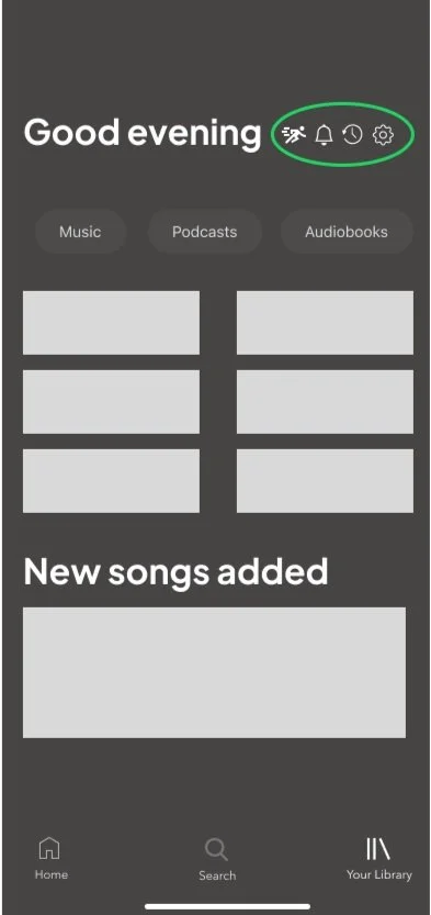
Integrating Spotify Audio Exercises onto the existing homepage
Different possibilities were tested to determine which worked best with the current Spotify UI. Option 4 aligned the best with the current homepage design.
Option 1
Option 2
Option 3
Option 4
User testing
Key findings from user testing
Knowledge Gaps: There were notable knowledge gaps between the users and the new fitness feature, indicating a need for clearer communication and onboarding.
Accessibility Issues: Users had trouble locating the fitness icon on the homepage, suggesting that its visibility and placement need improvement.
Seamless Integration: Despite the challenges, users felt that the fitness feature seamlessly integrated with Spotify, aligning well with their overall experience.
Iteration
Iterations made based on usability test results
The “Before” screens are those that were tested within a prototype during usability testing.
Homepage
The feature has been changed from a small pill tab at the top of the screen to a large section that takes up more space on the app.
The feature now has a space explaining what it is because users were unsure of what the feature did.
A callout is now provided to entice users to try it.
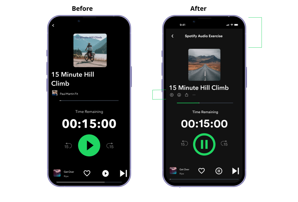
Workout page
The name of the feature is now displayed at the top so that the user knows they are engaged in the app.
The name of the fitness instructor has been replaced with the ability to add the workout, save the workout, and share it.
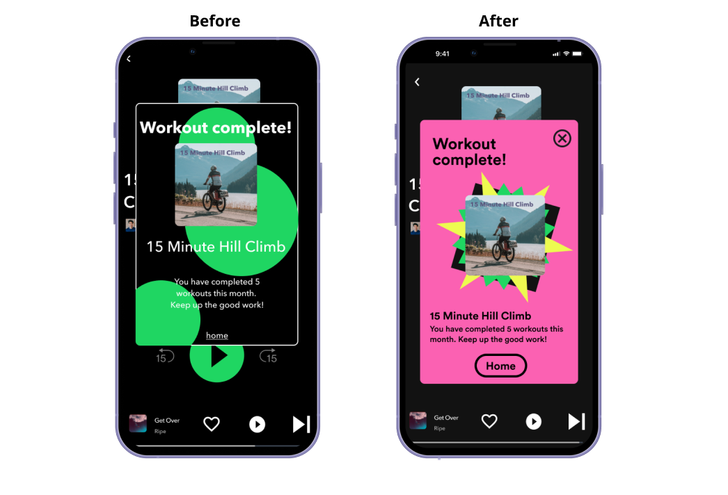
Workout complete page
Originally, the page was green. However, upon reflection, I realized Spotify uses bold colors.
An exit button is added so users can return to the workout screen.
The home button is enlarged and more in line with Spotify's brand.
Final Prototype
Key features
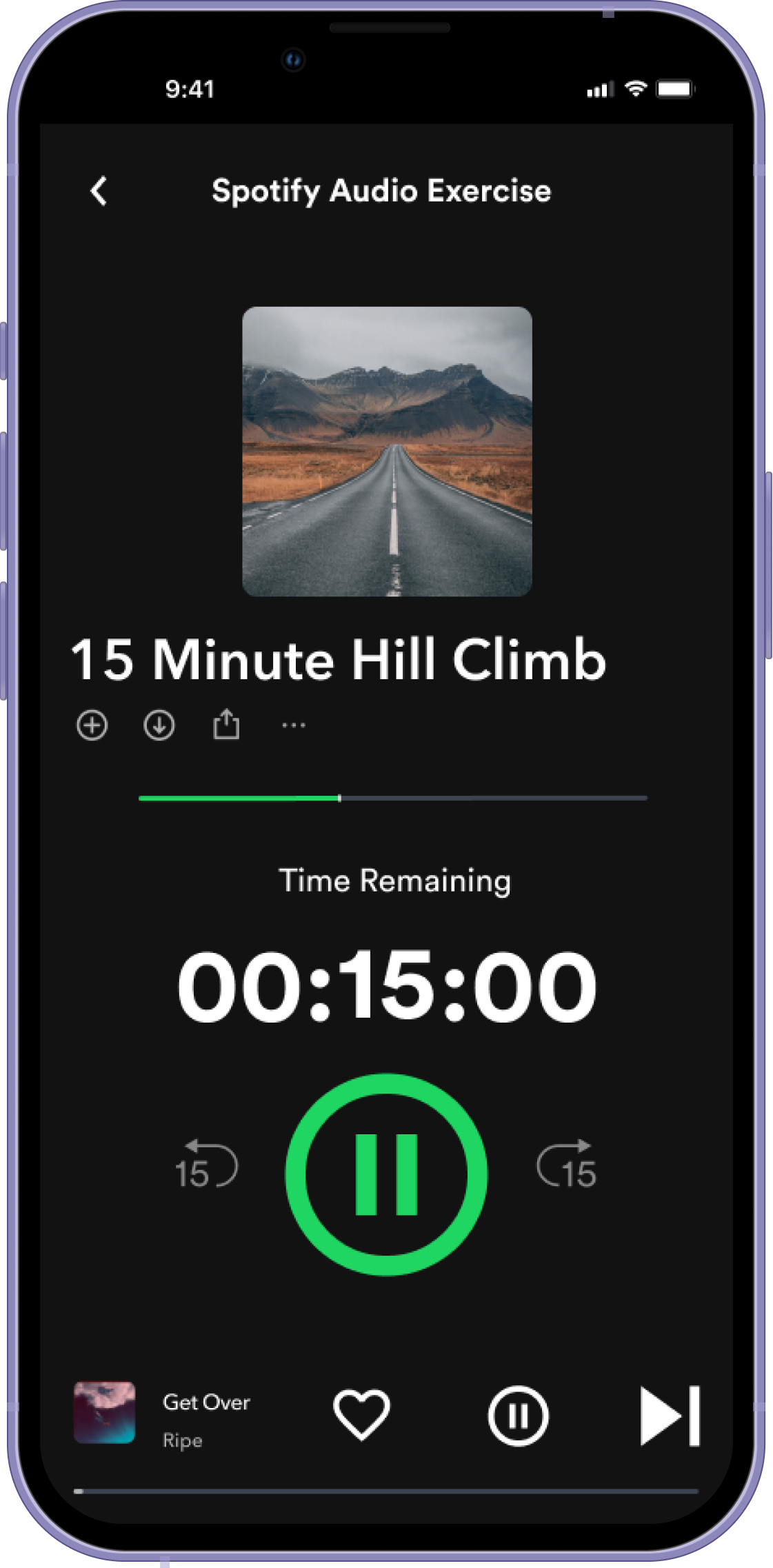
1. large button for the user to easily pause the exercise
2. Separate button for user to pause music and keep exercise playing
Final Screens
Reflections
Challenges and limitations
A significant challenge in this project was the time constraint. I initially thought it would be quick since it focused on adding a feature. However, integrating a new feature into an established platform proved complex and required thorough testing for a seamless user experience. Despite this, the project offered valuable insights for my future UX design work.
Key learnings
After initial usability testing, I found information gaps affecting users, prompting a redesign for better user experience. Sticking to the original flow would have compromised user-centered design.
While creating mid-fidelity wireframes, I explored several homescreen iterations. Initially, I chose homescreen 3, but testing showed homescreen 4 was better for the average Spotify user. I quickly adapted as I had already prepared this alternative.
Pride points
Though it was one of my biggest challenges, I feel integrating Spotify Audio Exercises with the existing Spotify UI was my greatest success. This accomplishment was particularly evident in the "Browsing Audio Exercises" page, where the seamless blend of the new element with the established design was a pride point.


